Apple is arguably one of the most influential companies in the world, as it received the top spot in Forbes’ list of most valuable brands. So, it’s no surprise that millions of people across the globe turned their attention to Cupertino, California on Tuesday to watch Apple CEO Tim Cook introduce the company’s new products.
While most news organizations covered the Apple event, only a few dedicated most of their online layout to the story. USA Today, for example, utilized the majority of their layout to showcase their coverage of the event from various angles. Some stories focused on the new iPhone 6 and Apple Watches, the repercussions the conference had on the stock market, and how technical difficulties caused frustration for some Apple customers. Most of the stories focused on a single topic, which simplifies the reading for viewers and also generates more web traffic for the publisher, as viewers have to click on different links if they want to know more about different products or angles.
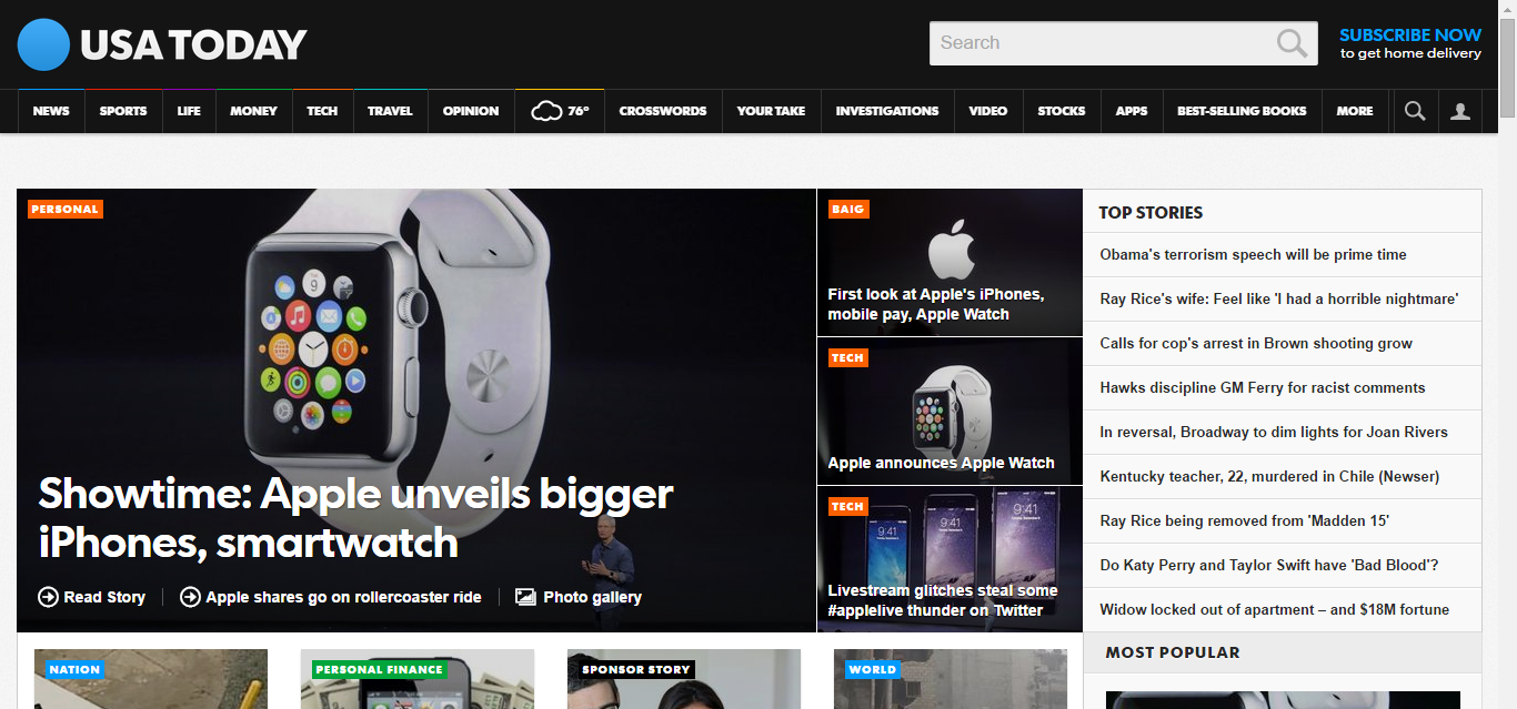
USA Today mainly utilized visual mediums such as photo galleries and posts from social media to demonstrate the products’ features. While the text does include valuable details about the particular stories, visual mediums are used throughout the pieces of keep the audience’s attention while they scroll down the page. There were also numerous links along the side of the pages to other stories about the Apple event, so readers could conveniently find whatever angle they’re interested in.
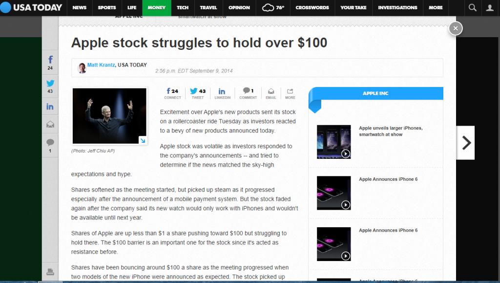
The stories were vastly different from some of the other coverage. Some reporters, such as markets reporter Matt Krantz, provided witty commentary on his social media accounts rather than tweeting about particular facts or statistics. However, his story about the volatility of Apple stock was completely professional and incorporated statistics, quotes from inside sources, and an overview of the market that was lacking on his Twitter account. The stories directly cited presenters such as Tim Cook, and used facts about the software or product design that were directly provided by Apple. The stories were well-written and had clear headlines that were easy to find via search engines.
USA Today also ensured that viewers were able to interact with the coverage. Each story featured options for readers to share the article on Twitter, Facebook, and LinkedIn, and showcased how many times an article was shared on each social media platform. There was also a live-blogging feature that was updated nearly every three minutes, which made readers feel more involved and provided more fodder for discussion in the comments section. These methods of sharing and interacting caused USA Today’s stories to float onto social media and bring in more people onto the site.

The mobile device display was solid, but it certainly didn’t provide the visual detail that was offered online. Many of the photo galleries and pictures looked better aesthetically on a computer screen, and the options to share the articles on social media were less obvious and convenient.
Apple is one of the world’s most profitable and influential companies because it dominates its competitors. USA Today may have tried to take a page out of Apple’s book, as it executed coverage of this event to near perfection and blew its news competitors out of the water.