
On Tuesday Apple CEO Tim Cook announced that the company is launching two new iPhones, a mobile payments system, along with the new innovation that sparked the most curiosity among consumers, the iWatch.
If you’re reading this blog post, there’s a good chance that none of what I just said is news to you because already heard this from one of the 9,053 websites that provided coverage of the launch yesterday.
So with this post, instead of reiterating what was covered, I plan to evaluate how yesterday’s launch was covered by news outlets. Specifically, I am going to examine how the good folks over at CNBC.com served you, the consumer, with their coverage of the launch. To do this, I have decided to hand out grades for each aspect of their online coverage because I am a guy and only thing that guys (not to stereotype, but..) like more than grades are rankings because they are basically analysis dumbed down to its simplest, most comprehensible, non-nuanced form. (And if you don’t believe me here’s some more proof.)
Here we go.
Accessibility
Upon visiting CNBC’s home page on Tuesday afternoon (during the time the launch occurred) the first story I saw featured at the top of the homepage was a live blog of the event, as well as a link below that read, “For all things Apple, click here.” This link brought you to a page with an array of news stories, columns and content regarding the Apple launch from CNBC in the past two weeks (this page apparently no longer exists, however).
For me, CNBC’s online coverage passed the litmus test of “Could my 92-year-old grandmother find it on the computer machine if she had to?” If she can, you can.
Grade: A for accessible enough for my grandmother.
Timeliness
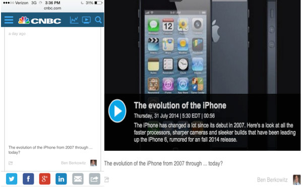
The aforementioned live blog provided instant updates from the launch and other information including details of the new products, pertinent tweets, and videos of U2 playing at the launch – the whole kit and caboodle.
However, when I tried to visit the same live blog on my iPhone, many of the videos being posted either didn’t appear or didn’t work. I found this significant because many people were likely at work or not in front of a computer when this launch occurred (middle of the day), and thus would have not been able to see the content on their phone instantaneously, and would have had to wait until they were front of a computer later. Regardless of how quick your content output is, if your readers are not able to see it, that’s a problem. Other than that blemish though, I found the timeliness of their coverage and updates to be more than adequate.
Grade: B for better make sure those videos work on my iPhone next time.
Source: http://www.cnbc.com/id/101981278
Content
As I mentioned before, CNBC organized all of their Apple coverage on to one page– which I found very organized and helpful — that they linked to on their homepage. This page featured every angle of coverage on the launch you could possibly want — whether to buy or sell Apple’s stock, how Apple is disrupting Chinese supply chains, and how U2 paid to play a role in the announcement.
This page included headlines, such as “Is Apple Pay a bitcoin killer?,” that effectively used keywords and simultaneously sparked the reader’s interest.
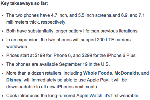
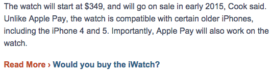
Additionally, at the top of the live blog included a bullet-point list of key details and takeaways from the launch. If I were a web browser looking for details on the newly launched products, this is exactly what I would want a website to provide. And of course, for those people looking for a little bit more coverage, below the list was a detailed news story including quotes from Apple CEO Tim Cook, as well as updates on how the launch has effected Apple’s financial stocks.
Finally, I’m not usually one who watches the videos on news story pages, but CNBC included a two minute recap video of the event halfway down the page of the news story. I found this video to be useful for someone who would rather see than read about what happened, and just the right length as well.
Grade: A for all the clicks and page views.
Engagement and Interactivity
Although CNBC did not include any reader polls on the news story, something they did that I found savvy was after a paragraph that included details about the newly launched iWatch, they embedded a link to a pertinent poll that asked whether or not readers would actually buy said iWatch — nice cheap way to get extra page views.
Although CNBC is a rather large, nationally–run website (which usually means lack of intimacy with the readers), I thought this was an effective way of engaging and including the reader in on the discussion.
Additionally, many people did not hesitate to weigh in on the story in the comment section, however, again, the volume of comments made it difficult for the author to interact with each and every commenter. (Disclaimer: I am very anti-comment sections only because more times than not they just turn into a cesspool of banter and hatred).
Where I thought CNBC failed to engage the readers was with their social media promotion (more on this next). Instead of including questions that invited feedback with their tweets and Facebook posts, they chose to include text that read more like a headline (which is fine in many cases, but isn’t as engaging and likely to receive clicks).
Grade: D+ for don’t you care about what I think, CNBC? 🙁
Social Media and Promotion
CNBC did the kind of heavy promotion that you would expect from a major news outlet for a story that interests so many. Although they failed to engage the reader with questions that invite feedback, where I thought they succeeded in their promotion was how they visually engaged and informed the readers with the pictures they attached to each tweet and Facebook post.
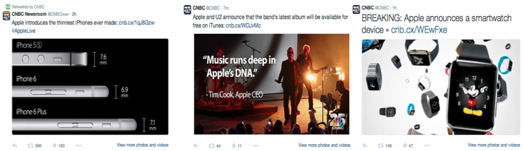
Pictures such as the one that compared the sizes of the new iPhones to older versions (above) in some cases told the reader everything they wanted to know, or at least caused them to click on the link to read more. Many of the other pictures they included were visually appealing and definitely would have made me more inclined to click as a reader.
Finally, the CNBC Facebook feed effectively used the aforementioned video titled, “A complete recap of Apple’s big event in two minutes to simply and effectively inform the public of the key takeaways. If I were someone scanning my newsfeed after a long day and just wanted a CliffNotes version of the event, that video would definitely satisfy me, both in content and duration. And apparently, many people agreed with me because that video got roughly 5–10x more likes than CNBC’s average Facebook post.
Grade = B for big, appealing pictures and videos that would appeal to my A.D.D.
Thank you!
This is a damn good post.